Experts Reveal 17 Small Space Decorating Mistakes That Are Cramping Your Style

Check out the recent Redfin article we were featured in: 

Experts Reveal 16 Small Space Decorating Mistakes That Are Cramping Your Style

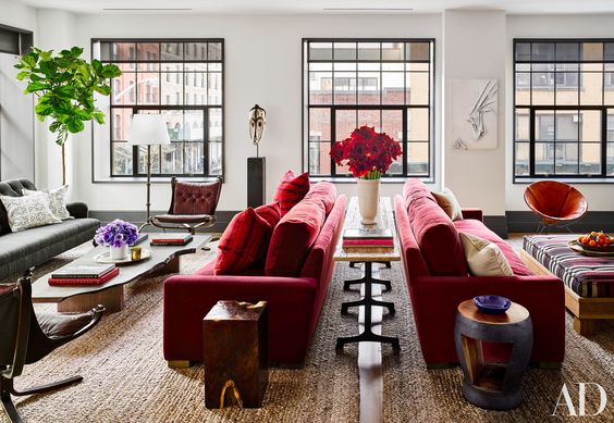
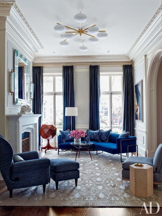
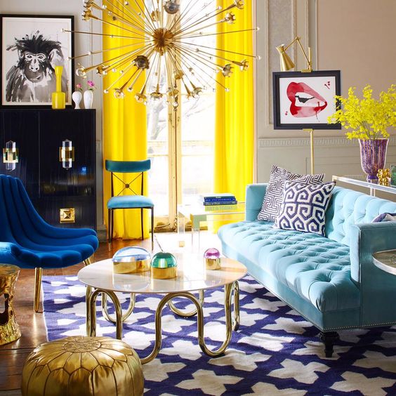
The possibilities for decorating a space are endless, but when faced with the additional challenge of less space, figuring out how to best utilize any available square footage can be daunting. And what can seem like the ideal setup in a cozy loft in New York, NY may not necessarily work in a 400 square foot apartment in Toronto, ON. Add in a couple of these common small space decorating mistakes, and it can make the walls appear like they're closing in. 

To help you avoid these mistakes, Redfin reached out to us and other design experts for our quick and easy fixes so you can decorate your space without sacrificing style. Here's what we had to say.

 Experts Reveal 16 Small Space Decorating Mistakes That Are Cramping Your Style


Pretty in Pink!

Oh Pink! It's a love it or hate it relationship for a lot of people, but it's a color that in time has always prevailed and for a while now, it's getting stronger than ever!

Last year Pantone came out with a duality as color of the year, and guess what? Pink was one of them, Rose Quartz to be more specific. After that as you can imagine, an entire revolution developed around this hue.  All the decor and fashion world came out with their best pieces to make of this hue and important asset whether in your space or your wardrobe or probably both. 

©Kelly Wearstler Interiors 

©Kelly Wearstler Interiors 

In fashion pink is now the color of powerful optimistic statements. All boss ladies out there get your pink suit on! 

In interiors, pink has always been qualified as feminine, but different shades of pink set different moods. A bright, vivid tone like fuchsia suggests energy and glamour. A soft and restrained pink, like blush, or a beige with pink undertones creates a soothing feeling. 

Pink can be paired with other colors, including chocolate brown, black, mint green, metallic gold and silver and white to create a variety of moods. When paired with a masculine hue like navy blue, pink can add a feminine balance.

©Kelly Wearstler Interiors 

©Kelly Wearstler Interiors 

Dusty pinks mixed with subtle neutrals add glamour to a bedroom. Pink can feel sophisticated when paired with brown or beige; try this color combination in a dining room with raffia walls.

It's always good to take in consideration that pink can be an overwhelming color when is not used carefully. 

I personally love how Kelly Wearstler handles it. It can be as a little pop of color for a neutral room, or an over the top crazy composition all over a space, that will definitely blow your mind and activate all your senses when you walk into the room. 

In architecture we can't forget when Ricado Bofil, decided to make his pink statement with La Muralla Roja in Spain!

© La Muralla Roja by Ricardo Bofil

© La Muralla Roja by Ricardo Bofil


                                                        XO,  

Tiara M.


Shades of Gray!

If your are looking for serenity, going for the color gray in your home decor is a great place to start, from wall treatments to the smallest decor detail in the room. Gray has an inherent calmness and sophistication. A solid gray symbolizes strength, while a softer gray offers a more delicate feel. 

©via Pinterest

Gray is a great canvas to make other colors stand out. It is definitely the favorite neutral for designers, is just simple glamour!

©Nate Berkus | via Pinterest

XO,

Tiara M.


In the name of Red!

©Christian Dior | ©Dimore Studio

The color Red can feel contemporary, traditional, rustic or timeless, not just in interiors but also in fashion, depending on the shade and context. A touch of red can warm up a white room, or add drama when used as the main color or focal point in the room. There are endless ways to use this warm shade to create a mood.

©Caroline Sarkozy | ©Meredith Heron

The many different shades create different moods, from a romantic merlot to a retro cherry shade. In fashion Red, is the obvious choice, but pink is more subtle if you're heading out on a date or have seduction on the brain.

©Architectural Digest | Interiors by: Ashe + Leandro 

©Architectural Digest | Interiors by: Ashe + Leandro 

                                          XO,

Tiara M.

Into the Blue!

Blue evokes feelings of calm and freshness, and represents strength and dependability. 

A high-energy shade of blue, like sapphire, can add a bold punch of energy to a room, while a light sky blue on the walls can make a space feel tranquil.

Darker shades like navy can offer drama, while paler shades can make small spaces feel larger. The effect depends on the tone of blue.

Since blue is associated with calmness, it works well in a bathroom, bedroom or kitchen, all rooms where one goes to relax.This one also in fashion are smart for fighting stress, not to mention that is a very versatile color. 

                                  XO,

Tiara M.

Brighter than the Sun!

Yellow adds optimism to your home, prompting feelings of happiness in all who enters, all because, it can activate memory, stimulate the nervous system and promote creativity.  

                                   Control the hue and you control the mood! 

©Living Room: Jonathan Adler | ©Nursery: id 810 Design Group

  • Muted yellow works well as a soothing neutral. 
  • A sun-kissed yellow brings the warmth of summer inside your home. 
  • A pale yellow can make a compact room feel larger. 

The wide spectrum of yellow shades gives you flexibility in designing rooms with a feel-good ambiance.                                                                                                                                           In Fashion yellow, orange, or other vibrant warm shades are good if you want to feel happier. 

©Delpozo Resort 2017 |©Elie Saab Resort 2017

                                                 XO, 


Tiara M.

Love me some Green!

Let's Start with Green, and for various reasons. Green is the color of the year, the color of nature and my favorite color, fair enough right?

Green evokes nature, the soothing quality of it makes it ideal for any room, it reminds us of life and renewal since is associated with nature. In fashion dark green is a great color to command power, whether at a work meeting or presentation. 

 It can be dramatic, refreshing and inviting!

A touch of green can give to your bathroom that spa-like feeling, while in the kitchen makes it feel airy and open.

Not a big fan of green furniture pieces or finishes? No problem, you can easily incorporate plants into the design, and what better touch of green than nature it self!


                                                                                                                     XO, 

Tiara M. 

Diving into Colors!

"Resloom, the Fabric of Tomorrow" September 1946.

"Resloom, the Fabric of Tomorrow" September 1946.

Oh Colors! Who doesn't love them right? We have so many out there, and there is always one that we can relate to the most, so I’ve been thinking; Why not dedicate an entire week to talk about them?

In the next few days I am going to be writing and posting, little articles about the qualities of each color that pops into my head, sounds interesting right?  Stay tuned and lets enjoy this colorful journey together! 

                                                                                                                                    XO, 

Tiara M. 

The start of something!

Here you are! Welcome to our blog, one that promises to worship design in all its splendor. I don’t know if you noticed, but across this website we have made very clear that Design, is our Passion, so please don’t forget it!

Let’s go a little back shall we?.. Since I can remember design has been all over me, I remember when I first got that artistic rush, I was dying to be a fashion designer ( don’t be surprised if in the future, you run into a few Fashion articles here). Later on when the time came to be all realistic and make decisions, I was leaning more towards Interior design, so I thought about it, and came up with an idea. Why not to go from the general to the specific? So, I went for architecture with the dream of, later focus on interiors and guess what? to incorporate fashion whenever I can.

 "an interior is the natural projection of the soul"

                                                -coco chanel.           

And so I did, I graduated from architecture and then moved to San Francisco, California to pursue my Interior Design dream, for me it was, and is the best complement to my architecture background.  After years of studying and working with important California based designers, which I consider the most wonderful experience in my profesional career so far, I moved back to Santo Domingo to make an even bigger dream come true | arcteriors | an architecture and interior design firm that focuses on making those spaces you have envisioned come to life, taking national and international projects.

Let's not make it longer than that, and continue an even greater design journey together! Thank you for stopping by and don’t forget to subscribe! 


                                                                                                           XO,                                                                                                                                     

                                                                                                                         Tiara M.